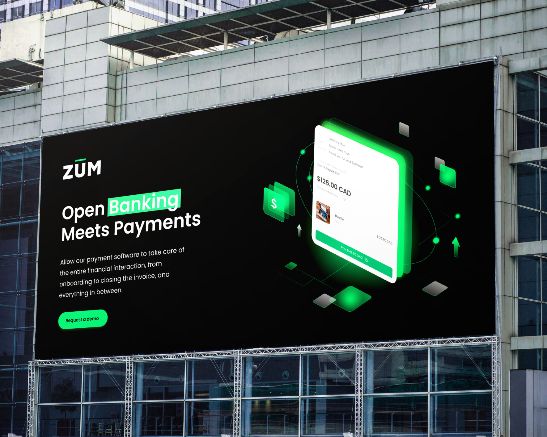


Zum is a game-changing company that combines open banking with cutting-edge payment solutions. Their innovative payment software streamlines the entire financial interaction process, handling everything from onboarding to risk management to invoice closing.
We had the privilege of working with Zum, a groundbreaking company at the intersection of open banking and payments. Our contributions encompassed a range of vital elements. First, we crafted a striking logo that exuded simplicity and boldness, featuring a vibrant green line above the letter “U” to symbolize speed and modernity. Building upon this visual identity, we designed their website, infusing it with a cool technological edge through the use of black and green. Additionally, we developed their newsletter, platform, and payment gateway, ensuring seamless communication, user-friendly experiences, and robust security. Collectively, our work enabled Zum to revolutionize the payments landscape, providing a comprehensive and streamlined financial interaction solution.
The Zum logo embodies simplicity and boldness. It features a bold white or black font with a vibrant, flashy green line above the letter “U,” cleverly transforming the pronunciation into “ZOOM.” This design element represents the company’s commitment to speed, security, and a modern banking experience, setting it apart from traditional financial institutions.
The Zum website showcases a striking combination of black and green, creating a visually appealing and technologically advanced look. The dominant black color infuses the site with a cool and futuristic edge, while the vibrant green accents convey a sense of innovation and freshness. The website presents Zum as a forward-thinking bank of the future, aligning its visual identity with its cutting-edge payment solutions.